It was a difficult task – we had to meld a contemporary plan from the architect with the homeowner’s traditional taste into a fashionable family home. We designed the spaces by building transitional style in every room including both the master and the children’s bathrooms. We mixed modern fixtures with dark woods and traditional faucets. By blending various styles we built spaces that will appeal to more potential homebuyers in the future.
Here’s a step-by-step design process to build a bathroom that will last through next year’s trends:
1) Wall-Hung Toilets and Wall Covering
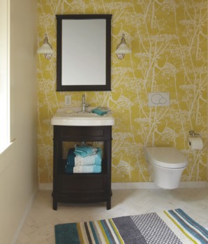
All the rage in Europe, a lot of stateside homeowners are deciding to use wall-hung toilets in their homes for the ease in cleaning. To soften the contemporary look of a wall hung toilet we chose a very organic bright colored wall covering. Even though the room could look stark, we helped that with the almost rustic patterned wall covering.
The room feels surprising because of this and other unexpected features. The uniqueness is what helps the room feel fresh and not dated.
 Interior Designer Barbara Schmidt / Photographer Tim Nehotte. Floor Tile: Chapter 16 West End White 3x9.
2) Pattern on Pattern
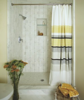
Choosing a Jeffrey Court Park Place tile in a traditional shape but updated pattern kept the shower feeling current and modern. The linear pattern in the shower wall feels almost like a wall covering and it’s an updated treatment of just plain stark white marble.
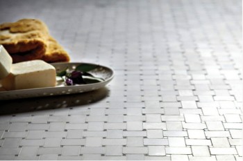
The main floor in the master bath is an elegant herringbone pattern that is also timeless and brings a European charm to the space. This floor took extra time for installation but was well worth it for the visual impact the homeowners will see every morning and every evening.
 Interior Designer Barbara Schmidt / Photographer Tim Nehotte. Featured Tile: Chapter 16 Times Square Mosaic, West End White 3x9
3) Dark Woods and Pops of Color
There are a lot of vanities out there but this one is a great example of the traditional and modern blending in harmony. The dark wood and caned drawer insert are very traditional but the open shelf and porcelain top feel a more contemporary.
By adding some bright blue and yellow we were able to help the space feel young and approachable. After all, the homeowners have three young girls that use this bath as well as Mom and Dad.
4) Soaking Tubs and Giant Showers
Scale is so important for any space. The giant master bath shower feels even larger because we used the same color palette for the floor and shower walls. It gives the illusion of an even bigger space.
In the girl’s bath, we set the tub into a space that was also tiled like the floor to give the illusion that it was larger. If you either match the floor or the walls it helps to visually trick the eye into seeing a more open space. We wanted both bathrooms to feel more airy.
 Interior Designer Barbara Schmidt / Photographer Tim Nehotte. Featured Tile. Chapter 16 Metropolitan Mosaic
5) Tile Forever not just for Today
Make sure to choose tile that will buck the trends and feel like a backdrop to changes down the road. Marble is just that – a classic that has been in vogue for centuries.
The investment in a classic tile will last throughout your home ownership and this is one item that should be carefully thought out. It’s very easy to paint a wall or change out towels. It’s a lot harder for homeowners to gut bathrooms to change fixtures and tile. Think about those new homeowners touring your home for sale and her them saying, “I love this tile – it’s one of the elements we don’t need to change.”
Remember to look at wall-hung elements to create that illusion of open space. Look for patterns in wall covering and tile that are timeless. Blend fixtures and furnishings so that décor crosses decades with a few unexpected pieces. Keep scale in mind and try to either cozy up wide-open spaces or simplify closed in spaces for a more airy feel. Choose tile that will stand the test of time both in style and quality with Jeffrey Court.


